Thrasher Photography and the Craft of Skate Magazine Work
Thrasher photography is shorthand for raw, real skate imagery made for print. Here is how magazine-style skate photos are approached, shot and edited.
What the term means
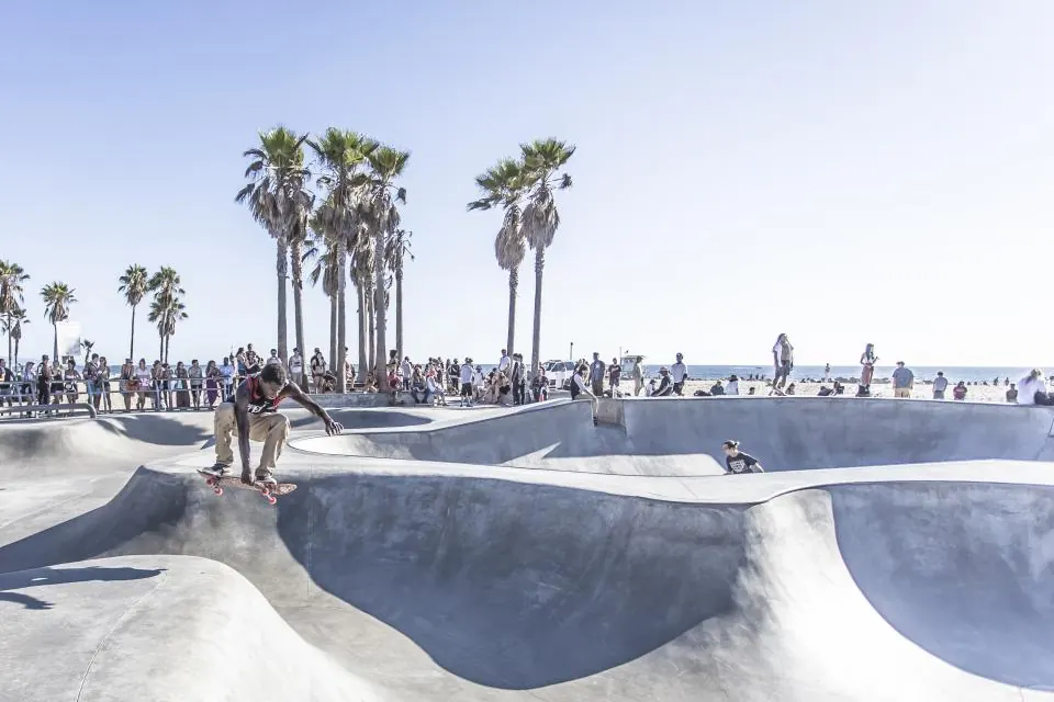
When skaters say Thrasher photography they usually mean a particular attitude: big tricks at gnarly spots, shot honestly, with little gloss. Thrasher, the San Francisco skateboarding magazine, has been part of skate culture for decades, and its pages helped define what a credible skate photo looks like.
The craft behind that look is less about a house style than about priorities. The trick has to be real, the spot has to be visible, and the photo has to make sense to another skater at a glance.
It is also about access and trust. Magazine-style skate photos are usually made by people who spend a lot of time with skaters, at spots most readers will never visit, during sessions that may end with nothing usable. The finished frame is the small, visible part of a much longer day.
The sequence
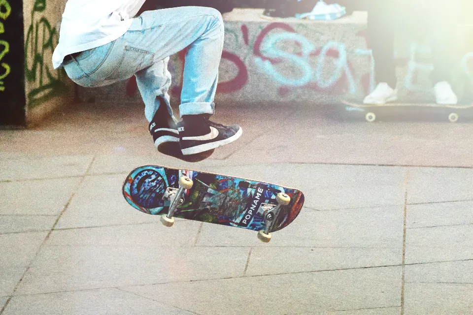
Sequences are a staple of skate print. A burst of eight to fifteen frames, composited or laid out in a strip, shows the whole trick from pop to landing. It answers the question every skater asks about a single photo: did they roll away?
Shoot sequences from a locked position with manual exposure and focus, and keep the skater moving across the frame rather than toward you. A slightly wider lens than you think you need gives the layout designer room to work.
Shoot a few extra frames before the pop and after the landing. Layout designers often need lead-in and roll-away space to make the strip fit a page, and a sequence that starts too late reads as a cropped trick rather than a complete one.
A skate photo has done its job when another skater looks at it and immediately knows the trick was landed.
Shooting with a cover in mind
Magazine covers usually need a vertical frame with clean space at the top for the masthead and room at the bottom for cover lines. That means planning a vertical version of the hero trick before the skater is tired, not as an afterthought.
Cover frames tend to favor peak action, strong contrast and a clear silhouette. Off-camera flash helps separate the skater from a busy background, and a dramatic sky behind a fisheye angle is a reliable look. Thrasher photography in the classic sense still prizes the trick over the lighting, though, so do not let the setup slow the session.
The culture of skate print
Skate magazines have long worked with a small group of photographers who travel with crews, shoot over weeks and know the skaters well. That relationship shows in the pictures. A photographer who has been at the spot for every slam is trusted when the make finally happens.
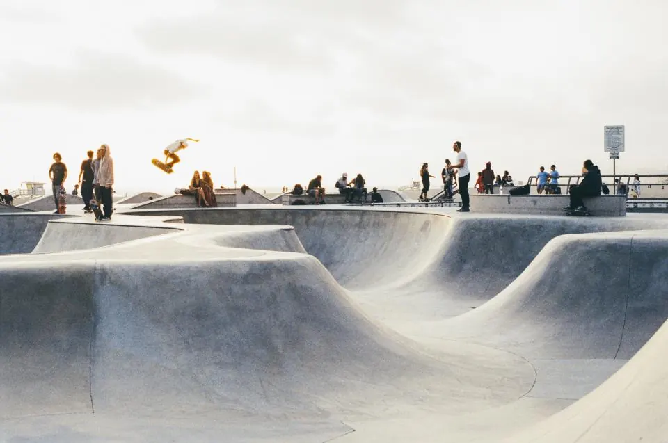
Print also rewards patience. A single trick might take an entire afternoon, and an article might combine shoots from several cities. In Los Angeles, that can mean a Downtown ledge in the morning, the LA River banks after lunch and a Venice session at sunset.
Film still has a place in that culture. Some photographers carry a medium-format camera loaded with Portra 400 or Tri-X for portraits and slower moments, alongside a digital body for action. The mix of formats is part of what gives skate print its texture.
Editing for the page
Edit tight. Pick the frame where the board, feet and spot all read clearly, then check it as a thumbnail; if the trick is not obvious at small size, choose another. Keep grading honest and avoid heavy retouching of the spot.
Caption accurately, including the trick name and location if the skater is comfortable sharing it. In magazine-style skate work, accuracy is part of the respect owed to the skater.
Before handing anything over, ask the skater whether they are happy with the frame. A photo of a make they are not proud of, or of a spot they want kept quiet, does more harm than good, and the working relationship matters more than any single picture.